
Japandi style: use less and keep more character
Japandi style combines Japanese restraint with Scandinavian warmth. Learn how function, materials, contrast, craft, and empty space shape the look.
Japandi style blends Japanese and Scandinavian design through function, restraint, natural-looking materials, craft, and deliberate empty space. It should feel warm enough to live in and edited enough that useful objects have room to matter.
That definition rules out the fastest imitation: buying a pale sofa, slatted cabinet, paper lantern, and a set of beige ceramics. Those objects can belong, but Japandi is not a product bundle. The room has to work, and the materials have to make sense together.
You can preview a Japandi room design in DwellShift using your own room photo and a brief that names what must stay. The Agent is helpful when the direction includes several linked decisions, such as lowering visual weight, warming the palette, reducing display, and preserving existing dark furniture.
DwellShift publishes this guide and recommends its own product. This is an editorial style guide, not a claim that DwellShift invented or defines Japandi. We did not run a controlled style-accuracy comparison across image tools.
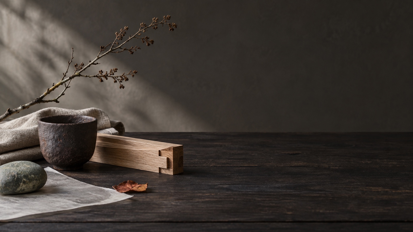
The cover is an AI-generated material still life. It is not a product photograph, cultural artifact catalog, or completed room. AI assisted the search research, structure, and draft.
What does Japandi style combine?
Japandi is a portmanteau of Japan and Scandi. Current explanations from Homes & Gardens and Livingetc describe the shared ground as simplicity, natural materials, function, craftsmanship, and warmth.
That shared ground does not make Japanese and Scandinavian design interchangeable. Japandi is a contemporary hybrid used in global design media and retail. It is more accurate to treat it as a selective design language than as a summary of either culture.
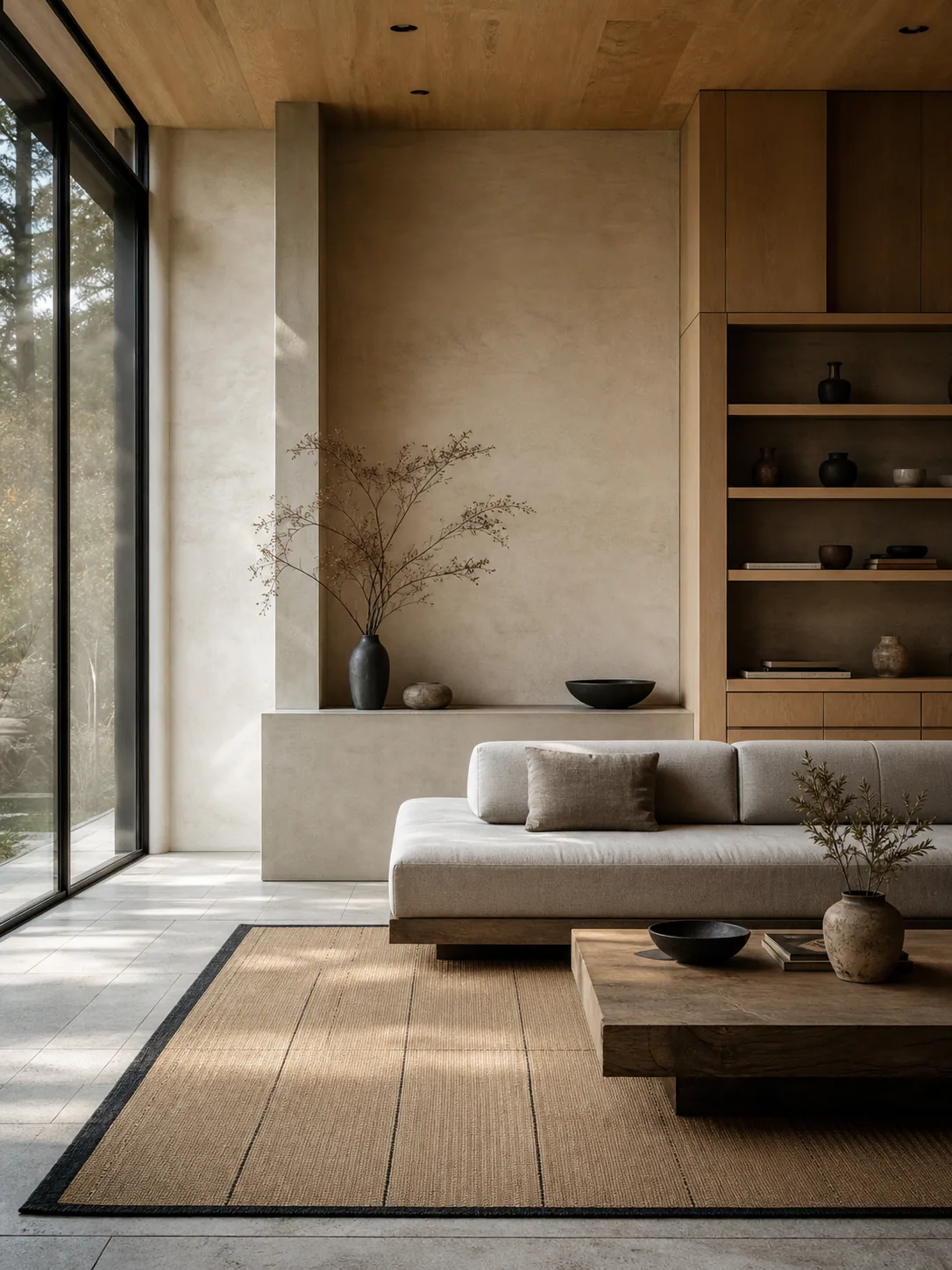
A Scandinavian-leaning version may use pale timber, softer upholstery, familiar modern furniture, and more casual layering. A Japanese-leaning version may use deeper shadow, lower visual weight, asymmetry, darker timber, and stronger attention to empty space. Your home does not need a mathematically equal blend.
Choose which side leads, then let the architecture and objects you already own affect the result.
Five tests for a convincing Japandi room
| Test | Ask this | Warning sign |
|---|---|---|
| Function | Does each major piece support a real routine? | Furniture is present only because it signals the style |
| Restraint | Is there room around the pieces worth noticing? | Every empty corner receives a basket, plant, or lamp |
| Material | Do wood, textile, clay, paper, stone, and metal relate? | Several imitation finishes compete at the same scale |
| Contrast | Can you read edges, depth, and focal points? | The whole room collapses into one beige value |
| Character | Do use, age, craft, art, and personal objects remain visible? | The room looks like a freshly staged product category |
These tests matter more than owning a standard set of Japandi objects. They also help distinguish a calm room from a bland one.
Start with what the room does
Japandi style is easier to achieve after the room's main use is clear. In a living room, that may mean conversation, reading, or quiet television viewing. In a bedroom, it may mean sleep, dressing, and a gentle nighttime route. In a kitchen, work sequence and storage have to survive the desire for clear surfaces.
Remove furniture that duplicates a job. One generous low table may be calmer than several small surfaces. A closed cabinet that holds daily clutter may contribute more than open shelves filled with objects bought to look handmade.
Low furniture often appears in Japandi imagery because it exposes more wall and keeps long sight lines. It is optional. Choose a seat height that works for the people using it. Physical comfort and access are part of function, not exceptions to the style.
For a living-room-specific plan, the existing guide on designing a Japandi living room without making it sterile goes deeper into seating, rugs, storage, and lighting. This article covers the broader style across the home.
Leave empty space where it can be felt
Empty space is not the area left over after shopping. It needs a relationship with the objects around it.
A clear stretch of wall can make one artwork more present. A bare section of floor can separate the entry route from seating. Space above a low cabinet can let its top line and the shadow behind it register. An unfilled corner can stop the room from becoming a perimeter of small furniture.
Do not confuse empty with unfinished. The rest of the room should provide enough weight, texture, and function to make the pause feel deliberate.
This is also where many AI concepts go wrong. A generator may remove ordinary possessions and call the result calm. If those possessions return with nowhere to go, the design was only empty for the picture.
Build a short material family
Choose one dominant wood relationship before adding accent materials. Pale oak with warm plaster and blackened metal will feel different from walnut with linen and aged brass. Both can support Japandi style.
Lay samples beside the existing floor, doors, and built-ins. Wood undertones can pull pink, gray, yellow, or orange under different light. The pieces do not have to match, but one tone should lead while the others appear in smaller amounts.
Then add texture with purpose:
- linen or wool where softness and sound absorption help
- clay or stone where weight and irregularity suit the use
- paper or translucent fabric where light needs diffusion
- dark metal where a thin edge or visual anchor is useful
Synthetic or manufactured materials are not automatically disqualified. Judge their surface, durability, construction, and relationship with the room. A convincing, maintainable finish is better than a fragile material selected only for its label.
When two finish directions are close, the controlled material comparison method can help isolate one surface family while holding the rest of the concept steady.
Calm needs contrast
All-beige Japandi rooms often look flat outside professional photography. Natural light changes. Lamps create smaller pools. Pale wood, cream fabric, and warm white paint can merge into one vague surface.
Add a darker value where it clarifies the composition: a timber frame, lamp arm, cabinet, textile stripe, or piece of art. Muted clay, moss, soot blue, oxblood, and brown-black can all belong when they connect to the materials and the room.
Contrast does not have to mean an accent wall. It may come from the edge of a dark chair against a light floor, a shadow line beneath a cabinet, or a matte ceramic against woven linen.
Test samples in daylight and at night. Generated color is useful for comparing relationships, but it cannot calibrate your paint, screen, room light, and product finish into one reliable color judgment.
Let useful objects carry the character
A room can be restrained without erasing the person who lives there. Books, records, tools, inherited furniture, children's objects, and art do not automatically break Japandi style.
Edit how they are grouped. A full shelf of used books may feel more honest than three isolated ceramics centered on three shelves. A scratched wooden stool may bring more warmth than a new object manufactured to look imperfect. A visible tea tray makes sense if it is used.
Craft matters because construction, grain, joinery, glaze, and weave remain visible. It should not become a demand to replace every ordinary possession with an expensive handmade version.
The strongest rooms usually keep something that does not fit the search-result stereotype. That friction stops the style from becoming a costume.
Translate the style by room
The same principles change shape across the home.
Entry
Keep the route obvious and give daily objects a place to land. One bench, tray, hook rail, or closed cabinet may be enough. The entry should not need a decorative vignette that gets dismantled whenever someone comes home with a bag.
Living room
Protect conversation, sight lines, and floor area. Use fewer tables, a restrained material family, and one or two dark anchors. Let books, art, and a useful lamp show how the room is lived in.
Bedroom
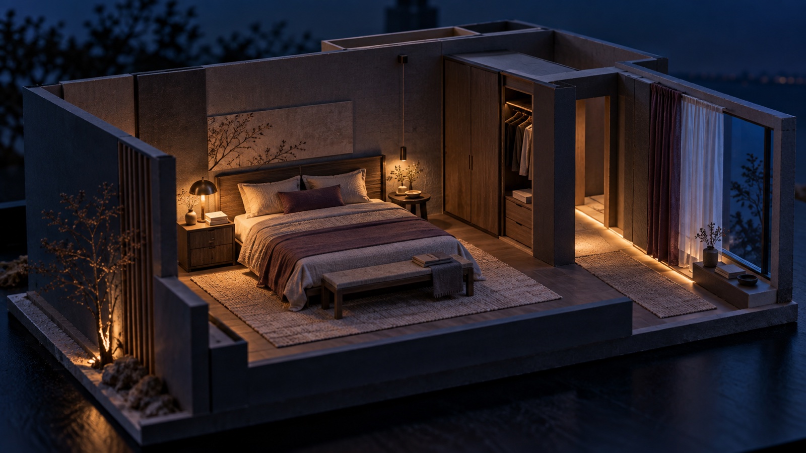
Soften the room through bedding, window control, a rug where it matters, and light at the bed. Keep wardrobe access and the nighttime route clear. Low beds are a visual option, not a requirement.
Kitchen
Clear surfaces require storage that matches real cooking. Hide what creates visual noise, but keep daily tools reachable. Natural timber and handmade tile still need suitable maintenance, heat resistance, water resistance, and installation.
Bathroom
Use texture and quiet contrast without compromising cleaning, slip resistance, ventilation, or water detailing. A concept image cannot verify any of those technical requirements.
Use references without copying the whole room
A useful reference has a job. You may want its timber contrast, low furniture, shadow, asymmetry, or mix of coarse and smooth texture. Name that job before uploading it.
The site's reference-led room design workflow lets a source room and a separate visual reference inform the same project. State which parts of your room must remain and which qualities of the reference should transfer. Do not assume a preservation request will lock the architecture perfectly.
For a direct photo concept, try a brief such as:
Keep the windows, doorways, oak floor, dark sofa, dining table, and camera view. Create a Scandinavian-leaning Japandi direction with warm off-white walls, pale oak storage, linen curtains, one charcoal lamp, and muted clay textiles. Reduce small display objects, but keep the books and existing artwork. Do not add slat walls, paper lanterns, boucle chairs, or new built-ins.
Sent with a room photo, an instruction this specific is submitted for generation right away. If you would rather compare options first, ask the Agent for directions and say not to generate yet.
The avoid list matters because image models know the visual shorthand of a trend. Without limits, they may stack every recognizable cue into one room.
The guide to avoiding generic AI room design explains why technically polished images can still feel interchangeable and how real constraints bring specificity back.
Buy after the idea survives the real room
Compare the concept with the original photo. Check every opening, fixed element, route, and piece you asked to retain. Then move from the image to samples, measurements, product data, and maintenance requirements.
Keep the useful relationship even if the generated object does not exist. You can search for a cabinet with the right height, timber weight, and closed storage without trying to locate the exact fictional cabinet in the image.
Japandi style works when the room becomes more useful, more coherent, and more attentive to what is already there. It fails when restraint becomes a reason to discard character. To explore the balance with your own space, open a Japandi room design study from your photo and narrow the direction before generating.
From reading to reimagining
Explore these ideas in your own space
Find a tool for the next step in your project.