
A practical guide to color drenching a room
Learn how to color drench walls, trim, doors, and ceilings with better samples, deliberate sheen choices, and fewer paint regrets.
A paint chip can look calm against a white wall. Once the white disappears, the same color occupies the ceiling, doors, trim, and every corner of your vision. It becomes a different decision.
That shift is the appeal of color drenching. Instead of outlining the architecture in contrasting white, you use one hue across most or all painted surfaces. The room can feel enveloping, orderly, dramatic, or surprisingly quiet. It can also expose an undertone you barely noticed on the sample card.
Good color drenching starts with observation, not bravery.
What counts as color drenching?
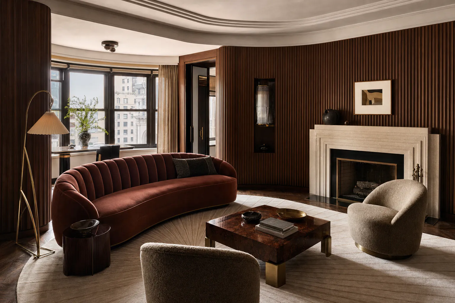
The simplest version uses one paint color on the walls, trim, doors, and ceiling. Different finishes can make those surfaces respond to light in different ways even when the color formula stays the same.
A related approach uses several shades from one color family. Walls might carry the middle value, with a lighter ceiling and a deeper built-in cabinet. The effect remains immersive, but the architecture has more visible separation.
Both approaches are useful. Choose between them according to the room rather than chasing a strict definition.
A low-contrast single color can calm chopped-up trim, multiple doors, and awkward corners. Related shades can help when a room has a ceiling detail worth showing or built-ins that should read as a distinct mass. Painting one accent wall while leaving every other surface white is a different technique; it concentrates contrast instead of removing it.
Read the room before choosing a color
Begin with the fixed materials. Flooring, stone, tile, countertops, and large textiles all influence how the paint reads. A soft green that looks dusty beside warm oak can turn sharp beside blue-gray flooring.
Natural light matters too. Note where the windows face, when direct sun enters, and which corners stay dim. Then look at the artificial light you use in the evening. Color drenching amplifies the relationship between the paint and every light source because there is little neutral trim to interrupt it.
Make a short list of what must stay. If the room contains a red brick fireplace, honey-colored floor, and navy sofa, your paint needs to live with those facts. Starting from an isolated trend color produces expensive surprises.
Test more than a small square
Tiny swatches encourage tiny thinking. Paint movable sample boards large enough to show the color as a field, then place them on several planes:
- a bright wall near the window
- the darkest wall or corner
- beside the floor and largest piece of furniture
- overhead, if the ceiling will be painted
Move the boards through the room and inspect them in the morning, afternoon, and after dark. If you are considering one color in several finishes, sample those finishes too. A glossier surface reflects more light and can make the color appear different.
Do not judge a wet coat. Let the sample dry according to the manufacturer's guidance, and use the intended primer or base where it may affect the result.
If you still cannot decide, paint a larger test area that includes a corner and a piece of trim. Corners show how the hue builds in shadow. Trim reveals whether the loss of white contrast feels restful or heavy.
Choose the sheen surface by surface
Using one color does not require one finish. Sheen has practical and visual consequences.
Walls are often painted in a matte, flat, or eggshell finish, depending on the room and how much cleaning they need. Trim and doors may use a more durable satin or semi-gloss. A ceiling can stay matte to reduce glare and disguise minor surface variation.
When the same color moves from matte wall to satin trim, the shift in reflection creates a subtle outline. That can preserve architectural detail without returning to white. Using the same finish everywhere produces a more continuous field, though the finish still needs to suit wear, moisture, and substrate.
Product names and performance vary by manufacturer. Read the technical guidance for the exact paint line rather than assuming every eggshell or satin behaves the same way.
Decide whether the ceiling belongs in the scheme
The ceiling changes the emotional weight of a drenched room more than any piece of trim.
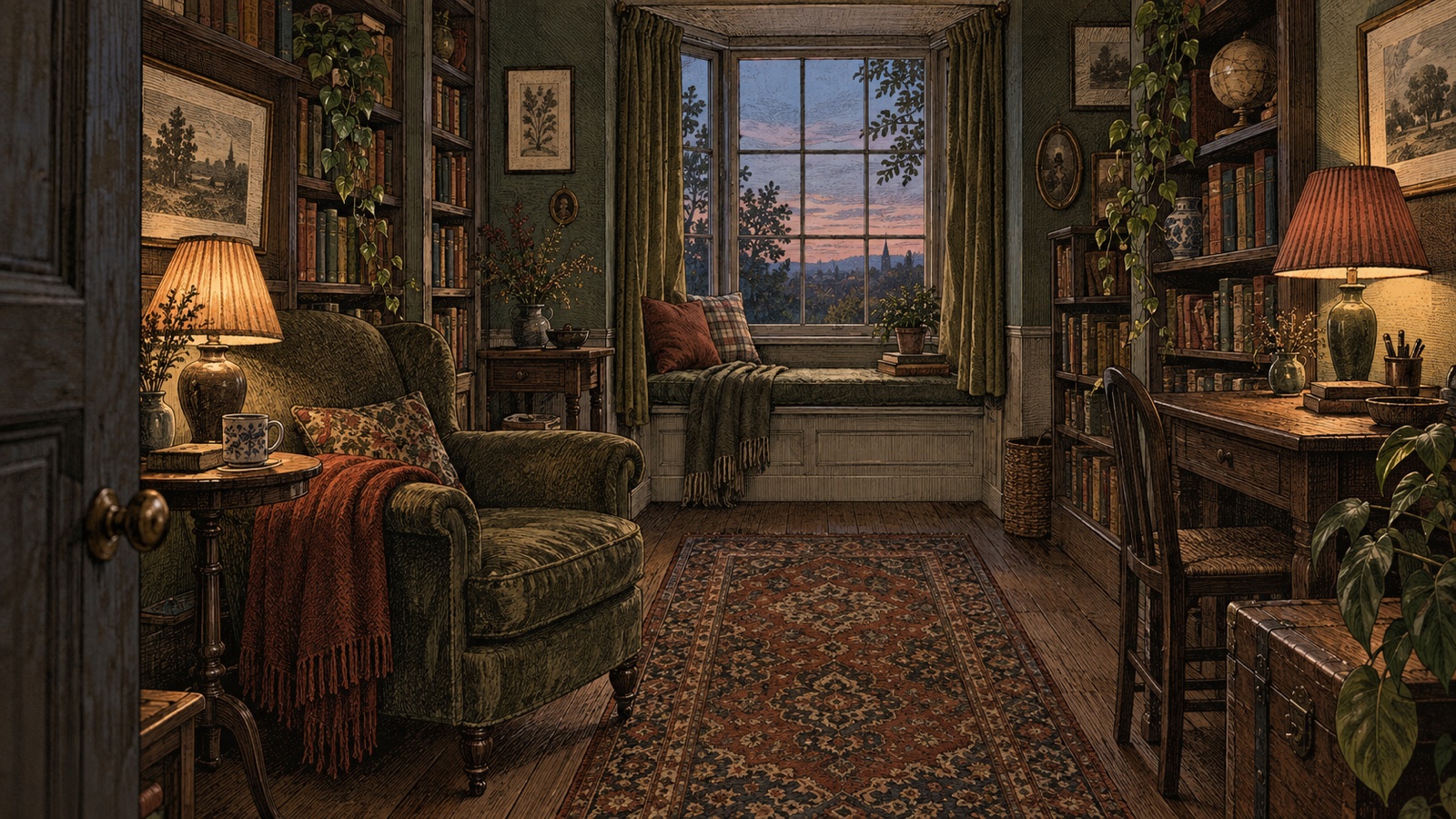
Painting it the wall color can make a bedroom, library, or dining room feel settled and intimate. In a bright room, it may reduce the visual interruptions created by a white cap. Deep color overhead can be beautiful when the room has sufficient light and the effect is intentional.
There are also good reasons to adjust it. A low ceiling with little daylight may benefit from a lighter related shade. A ceiling with visible repairs may look better in a forgiving matte finish. In an open-plan space, carrying one ceiling color across several zones may connect rooms you wanted to distinguish.
Test the overhead color from the places where you actually sit and lie down. Looking straight up from bed is different from viewing a painted ceiling in a standing photograph.
Use color to simplify awkward architecture
Contrasting trim outlines every edge. Sometimes those edges deserve attention. Sometimes they form a restless map of short walls, bulkheads, shallow cupboards, and mismatched doors.
Color drenching can quiet that map. A radiator cover painted with the wall may recede. A small door beside a larger one becomes less insistent. Shelves painted inside and out can read as part of the architecture rather than furniture placed against it.
This is especially useful in transitional spaces such as hallways, where many doors interrupt a limited wall area. It can also help a small room feel more coherent because the eye is not repeatedly stopped by white borders.
Coherent does not automatically mean larger. Dark colors do not obey simple room-size rules, and pale colors do not rescue a poor layout. Choose the atmosphere you want and judge the actual samples in the actual light.
Keep the preparation visible in your plan
A single color can look simple while requiring careful prep. Walls, trim, doors, radiators, and cabinets may be made from different materials and coated with different existing products. Each surface may need its own cleaning, sanding, repair, primer, or paint system.
Plan the work in a logical order. Repair cracks and failed caulk before the finish coats. Label doors and hardware if they are removed. Protect hinges rather than painting over them. Allow enough drying and curing time before closing painted doors or loading shelves.
Deep colors can make poor cutting-in and damaged surfaces more noticeable under side light. Pale colors can reveal dirt and scuffs quickly. The success of the room depends as much on surface condition as on the chosen hue.
If the project includes lead hazards, water damage, unstable plaster, extensive mold, or coatings you cannot identify, pause the decorative plan and get appropriate professional advice.
Give the room an exit route
Painting every surface is a commitment, but it does not need to trap the future room.
Keep large furnishings flexible if the paint color is strong. A neutral sofa or timber table can remain useful through several wall colors. Save the exact paint details and finish names for touch-ups. Leave a labeled sample board with the project records.
If the result feels too dense, you may not need to repaint everything. More directional lighting, a lighter rug, uncovered window glass, or a less crowded wall can change the balance. A contrasting ceiling is another option, though it brings the room closer to a conventional wall-and-trim scheme.
Preview the effect without trusting every pixel
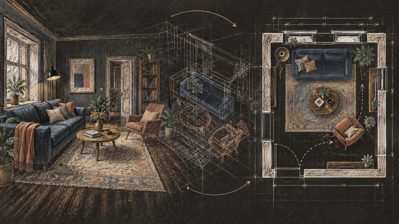
An AI interior design preview can help compare a fully drenched room with a lighter ceiling or contrasting built-ins. Use a photograph that shows the ceiling and trim clearly. Name the surfaces you want recolored and ask that flooring, windows, and furniture remain unchanged.
Use the material and color study workflow when the paint must be judged beside timber, stone, fabric, and metal rather than as an isolated hue.
Generated color is not a paint match. Screens vary, images are processed, and the model may change the lighting along with the walls. Use the preview to evaluate distribution and mood. Use physical samples to choose the product.
If the goal is a quieter room with restrained contrast, compare this approach with the Japandi palette guide.
Questions people ask about color drenching
Does color drenching make a room look smaller?
It can make the boundaries feel closer, especially with a deep color and low light, but the effect is not universal. Removing contrasting trim may also make a complicated room feel less fragmented. Sample the ceiling and corners before deciding.
Should the trim use the same paint as the walls?
The color can match while the paint product or sheen changes for durability and definition. Check what the manufacturer recommends for each surface.
Can I color drench with a light color?
Yes. Soft off-whites, muted pastels, and pale earth colors can create an immersive effect without the visual weight of a dark hue. Undertones remain important because the color covers so much area.
Which rooms suit color drenching?
Bedrooms, dining rooms, powder rooms, studies, and hallways are common candidates, but any room can work if the light, fixed materials, and desired atmosphere support the choice. There is no room-type requirement.
Is tonal color drenching easier than using one color?
It may feel less intense because the ceiling or trim can be lighter, but selecting related shades adds another set of undertone decisions. Test the colors together on the surfaces where they will appear.
From reading to reimagining
Explore these ideas in your own space
Find a tool for the next step in your project.